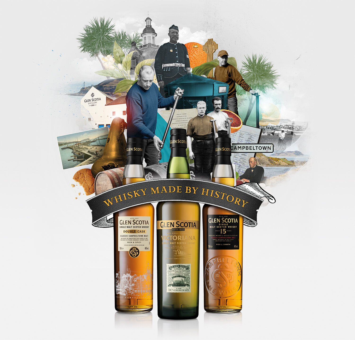
Glen Scotia Brand Positioning
Art Direction | Digital
We were tasked with creating a brand new look and positioning for Glen Scotia Single Malt Scotch Whisky. Our main aim was to reinforce the brand to existing and new whisky drinkers and to give them a compelling reason to try Glen Scotia.
In the Victorian age, Campbeltown (where Glen Scotia hails from) was known as the ‘whisky capital of the world’ - one of the five distinctive malt producing regions of Scotland. Our campaign was therefore going to reflect Glen Scotia’s unique place in the Campbeltown region’s story – and therefore the Scotch whisky story. Knowing all this, we positioned Glen Scotia as ‘Whisky Made By History’. It is a brand that is resilient, warm and genuine, and while clearly knowing its stuff, it doesn’t take itself too seriously. It should create intrigue, inviting the drinker to discover Glen Scotia and its provenance for themselves.
After my initial art idea was approved, I worked with photographer, Elliot Hatherley and illustrator, Nazario Graziano to create a series of collage style illustrations, using a mixture of new and archive photography to reflect Glen Scotia as a brand steeped in history in an engaging and entertaining way. This contemporary art style successfully set a fresh and quirky tone for the brand.
The campaign featured press advertising for Glen Scotia’s three main expressions, 15 Year Old, Double Cask and Victoriana. I also updated their website based on the new look of the positioning and created a series of fun animated social posts.
Glen Scotia’s new look has now become more than a just a one-off campaign. The brand guidelines have now also been updated to show how the new look and feel should be used to develop all new communications for the brand going forward.
Created with Story UK


